How America funds public schools.
Four charts, one CSV. The U.S. spends about $17,700 per pupil on current operations, in real 2024 dollars. The federal share is normally below 10%, briefly rose to 13% during ESSER, and is settling back. The state and local shares each sit around 43–45% nationally — but a 50-state ranking shows what the national average hides: the top state spends 3.1× the bottom state per pupil.
U.S. per-pupil spending has grown 57% in real terms since 1989.
The line you almost always see in a news article is "per-pupil spending." Two definitions matter. Current operating spending is the day-to-day money — instruction, support staff, administration, transportation, food, plant operation. Total spending adds capital outlay and debt service — buildings, buses, technology investments. They diverge sharply in capital-project years (you can see Sycamore's new high school spike in our Ohio analysis below).
Chart 01 · Time series
Both lines are the dollar-weighted national average across roughly 14,000 regular public school districts each year, deflated to 2024 dollars using the BLS Consumer Price Index for All Urban Consumers (CPI-U). The current-operating line strips capital outlay, which makes year-to-year comparisons cleaner. The gap between the two lines reflects the volume of capital construction — wider in 1998–2003 and 2018–22.
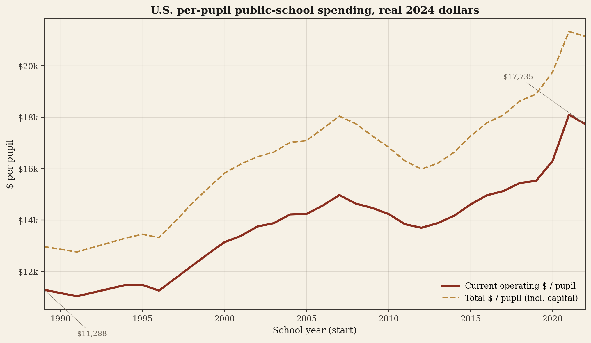
Real growth of 1.4% per year sounds modest but compounds. The driver is not raises matching CPI — average teacher salary growth in real terms has been near zero across this period. The growth is in which services schools deliver: special education caseloads, technology, English-language services, mental-health staff, school resource officers, and food service. The same per-pupil dollar buys a different bundle than it did in 1990.
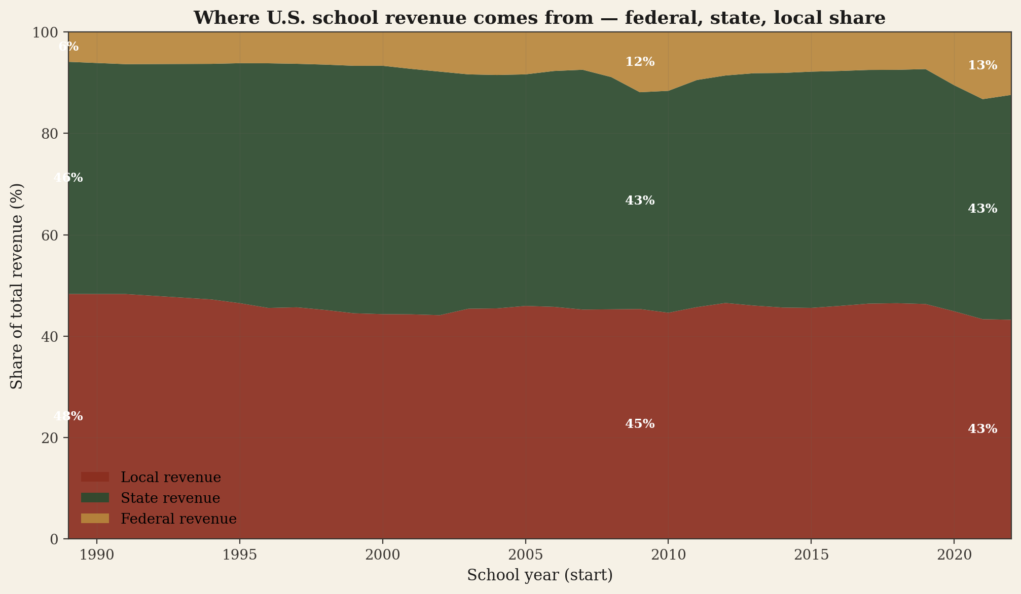
The local–state–federal mix is structurally stable, with two visible exceptions.
Public schools are a state responsibility under the U.S. Constitution — every state has language in its own constitution requiring the legislature to establish a school system. In practice, the cost has been shared three ways since the 1965 federal entrance under the Elementary and Secondary Education Act. The shape of that share is one of the most stable structures in American public finance — and the deviations from it are the two interesting stories in the chart below.
Chart 02 · Stacked area
Bottom band is local revenue (mostly property taxes plus parent-government appropriations). Middle band is state revenue (foundation/formula aid plus categorical programs). Top band is federal revenue (Title I, IDEA, school nutrition, plus the 2020-22 ESSER pandemic surge). Bands sum to 100% by year. The two visible deviations are the 2009 ARRA stimulus (state share lifted by ARRA replacement aid) and the 2020-22 ESSER surge (federal share lifted to 12-13%).
What's not in this chart, and why it matters
The "state share" line aggregates fifty very different state systems. Hawaii is essentially 100% state-funded (the Hawaii DOE is the only K-12 system in the state). Vermont, New Mexico, and Minnesota have state shares above 60%. Illinois, Pennsylvania, and New Hampshire have state shares below 30%, with the difference made up by local property taxes. The national average smooths this dispersion. The state-by-state ranking below is the better picture of variation.
The top-spending state outspends the bottom by more than 3 to 1.
The single most-cited fact in K-12 finance discussions is the dispersion between states. It is real, large, and enduring. The chart below ranks all 50 states plus DC by current per-pupil spending in 2022, in real 2024 dollars.
Chart 03 · Horizontal bar ranking
Each bar is the dollar-weighted average across all regular public-school districts in that state. Capital outlay excluded. Ohio is highlighted in ochre. The dotted line is the national median ($16,341). Bars below the median are colored brick; bars above are colored forest.
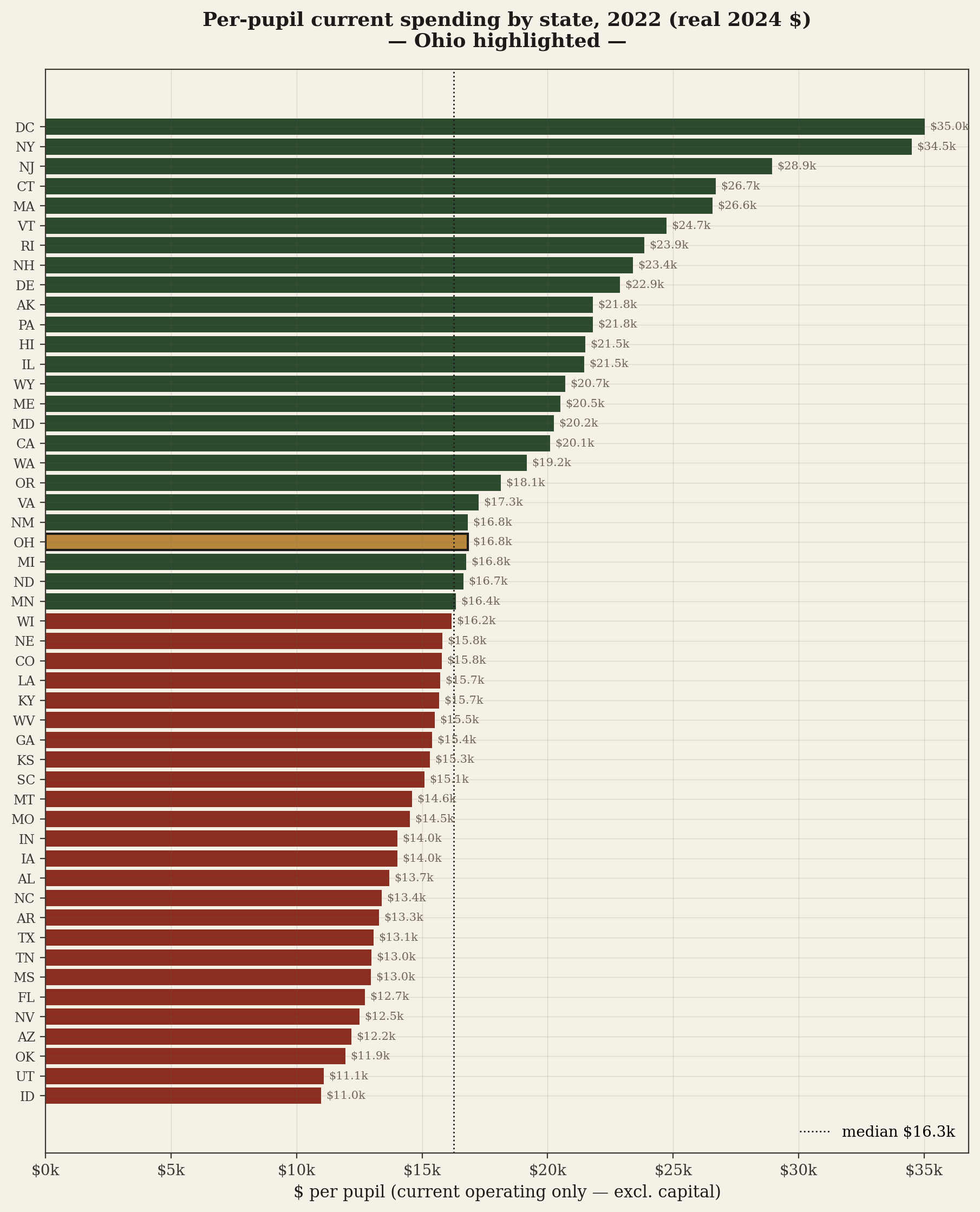
NY $34,505 ÷ ID $10,978 = 3.1×. Same federal IDEA mandate. Same federal Title I formula. Same NCLB / ESSA accountability stack. Same pediatric population. Same number of Mondays in a school year. The ratio is essentially all driven by state and local revenue capacity and willingness — and within that, by how each state's constitution and statutes split the bill between the state budget and local property taxes.
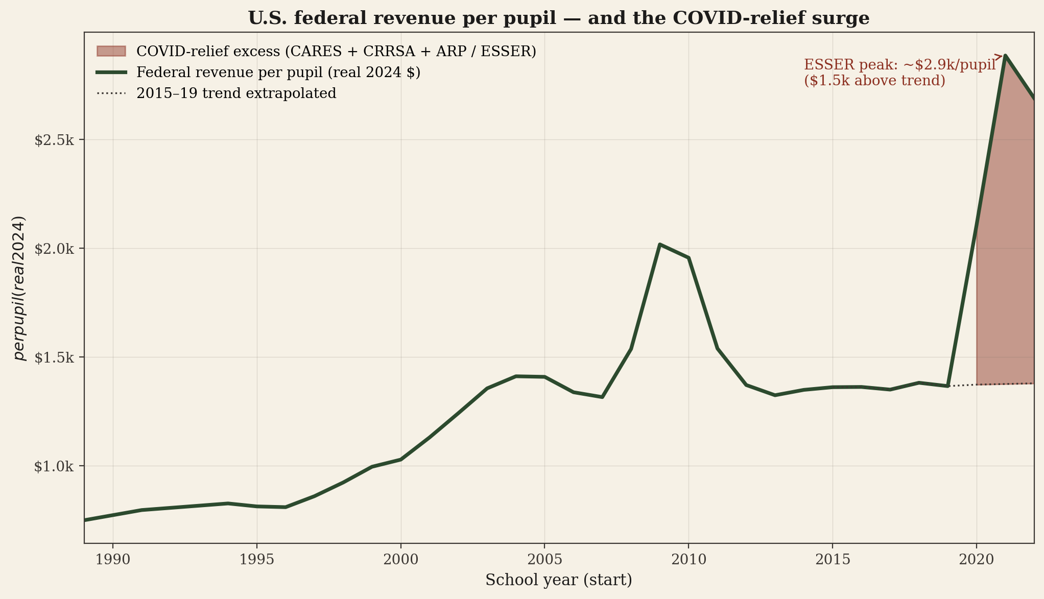
ESSER produced the cleanest federal-share spike in the entire series.
The federal share of K-12 revenue normally runs 7–10%. It is the smallest of the three legs and the most stable. The CARES Act (March 2020), the CRRSA Act (December 2020), and the American Rescue Plan (March 2021) collectively appropriated approximately $189.5 billion to the Education Stabilization Fund, the bulk of it routed to states and on to districts as the Elementary and Secondary School Emergency Relief (ESSER) fund.
Chart 04 · Federal revenue with COVID surge
The solid line is total federal revenue per pupil, in real 2024 dollars. The dotted line is a counterfactual: what the federal line would have looked like if the 2015–19 trend had continued through 2022. The shaded area between the two is the implied COVID-relief excess. Across 2020–2022, that excess sums to roughly $165 billion — consistent with the $189.5B nominal ESSER allocation, with a tail still being spent in 2023–24 (not yet visible in our data).
A national average hides a 3-to-1 ratio. The story is in the dispersion across states — and inside each state, the dispersion across districts. Ohio is one cut of that story.
→ Read the Ohio cut