How Ohio funds its public schools.
Ohio is structurally more local-funded than the U.S. average — and the gap has been widening for a decade. The state share has fallen from 44% in 1989 to 34% in 2022. Federal money carried Ohio through the pandemic and is now collapsing back. The dispersion across Ohio's 600+ districts is large but smaller than between states. Sycamore is in the top 7% of locally-funded districts.
Ohio's revenue mix is structurally local, by design.
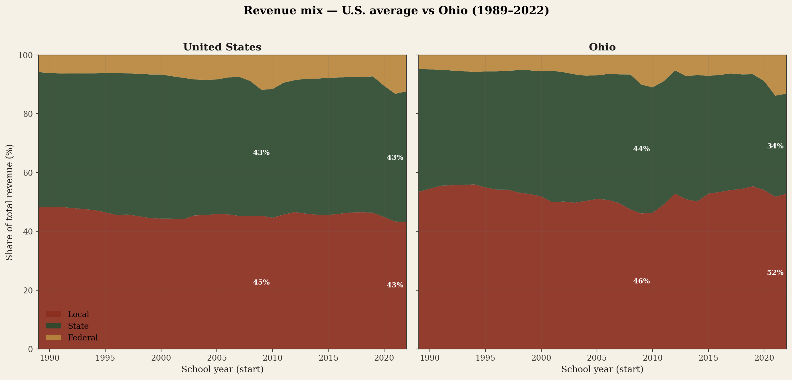
Both bands sum to 100%. Compare the green band height (state share) between the two panels. In 1989 the two were nearly identical — Ohio's state share was 44.4%, the U.S. average was 46.4%. Three decades later, the U.S. state share is essentially unchanged (44.4%) while Ohio's has fallen to 34.0% — a ten-point decline. The space the state vacated was absorbed by local property taxes.
Chart 01 · Side-by-side stacked area
Each panel is a stacked-area plot summing to 100%. Bottom band is local revenue (mostly property taxes), middle band is state revenue (foundation/categorical aid), top band is federal revenue. The U.S. panel aggregates ~14,000 regular districts each year. The Ohio panel aggregates the ~605 Ohio districts each year. Both are dollar-weighted.
The structural retreat of Ohio's state share is not random policy drift. It is the product of HB 920 (1976) reduction factors, four DeRolph rulings the General Assembly never fully implemented, and a series of post-2015 budget choices culminating in the HB 96 freeze of the Fair School Funding Plan inputs at FY2022 levels. The narrative pages on this site walk through each — see the cross-links at the bottom.
Federal money flowing to Ohio is three programs — until ESSER.
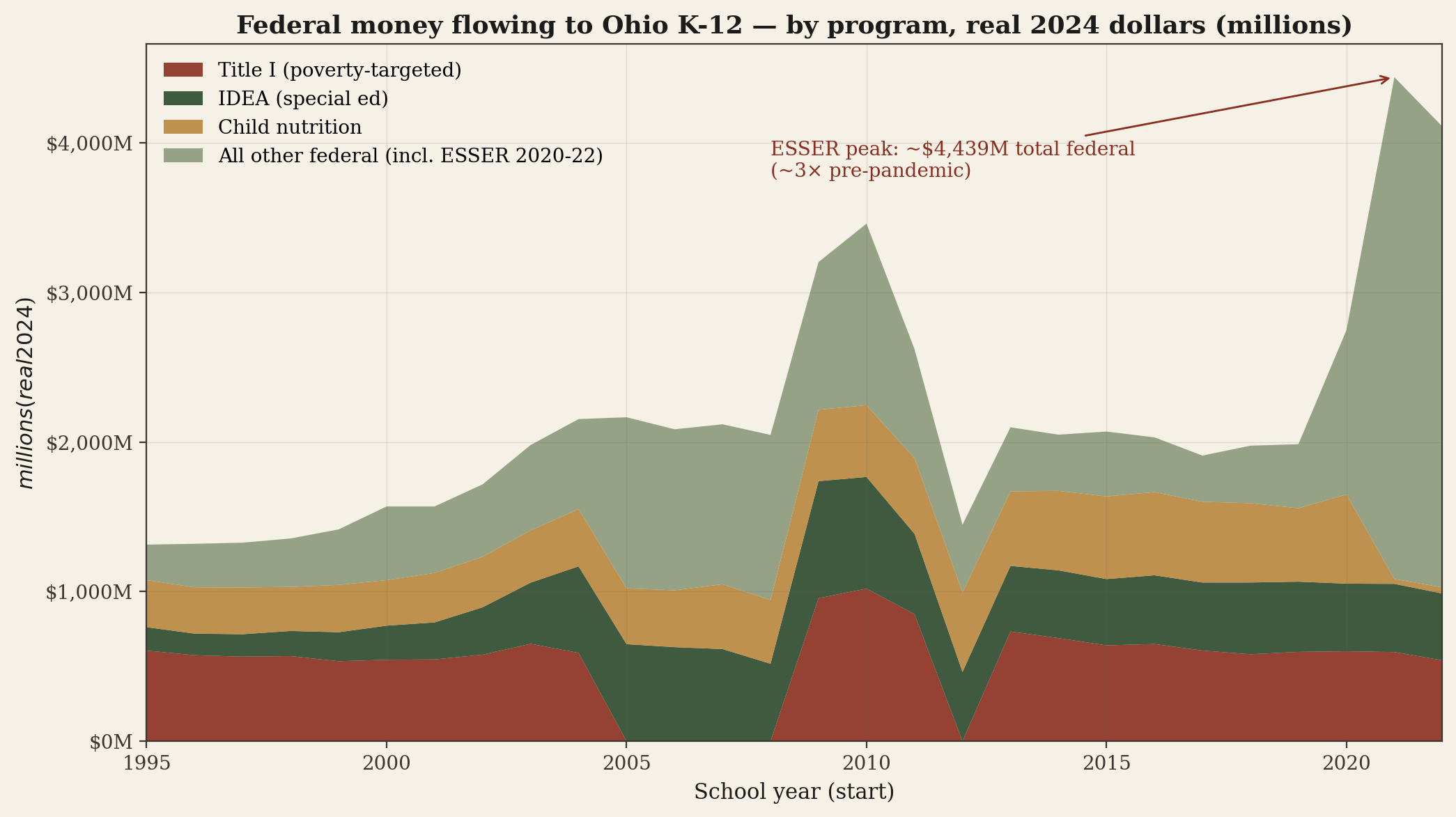
Outside the pandemic years, federal money to Ohio K-12 is dominated by three formula programs that have existed for decades. Title I (Elementary and Secondary Education Act, 1965) flows to schools serving low-income students. IDEA (Individuals with Disabilities Education Act, 1975) reimburses a portion of special-education costs. Child nutrition (school lunch + breakfast, 1946) reimburses meal service for free and reduced-price meals.
Chart 02 · Stacked area
Annual federal revenue to Ohio's regular public-school districts, broken into the three durable formula programs and "all other federal" (which absorbs every smaller line item plus the FY2020-22 ESSER pandemic surge). Real 2024 dollars; CPI-U deflator. The series begins 1995 because the Title I and IDEA fields are not consistently coded across districts in earlier years.
The three durable programs, in plain language
Title I — Improving the Academic Achievement of the Disadvantaged. Targeted to schools with high concentrations of low-income students. Allocation is formula-driven (district poverty count from Census SAIPE × per-pupil cost factor × state-specific adjustment). Title I is the single largest federal K-12 program in normal years. Ohio's Title I allocation runs around $550–600 million annually.
IDEA Part B — special education. Reimburses a portion of the cost of educating students with disabilities aged 3–21. Originally promised to cover 40% of "excess cost"; the actual federal contribution has long been around 13–15%. Ohio's IDEA Part B allocation runs around $480–520 million annually.
Child Nutrition. Reimburses school meal service. Free and reduced-price meals to eligible students; some additional reimbursement for paid meals. Roughly $400–500 million annually to Ohio in normal years; spiked during the universal-free-meals waiver period in 2020-22.
Half of Ohio's districts are at or near the floor; the other half is the chart's wide tail.
The state-share trend line obscures a fact that matters enormously: Ohio's districts are not similarly funded. The 20-mill floor in Ohio law (House Bill 920, 1976) creates a structural asymmetry. Districts at or below 20 effective mills capture inflationary growth in their voted operating millage automatically. Districts above 20 mills do not — HB 920's reduction factor rolls back voted millage as property values rise, freezing nominal revenue. This produces two populations of Ohio districts with different financial trajectories.
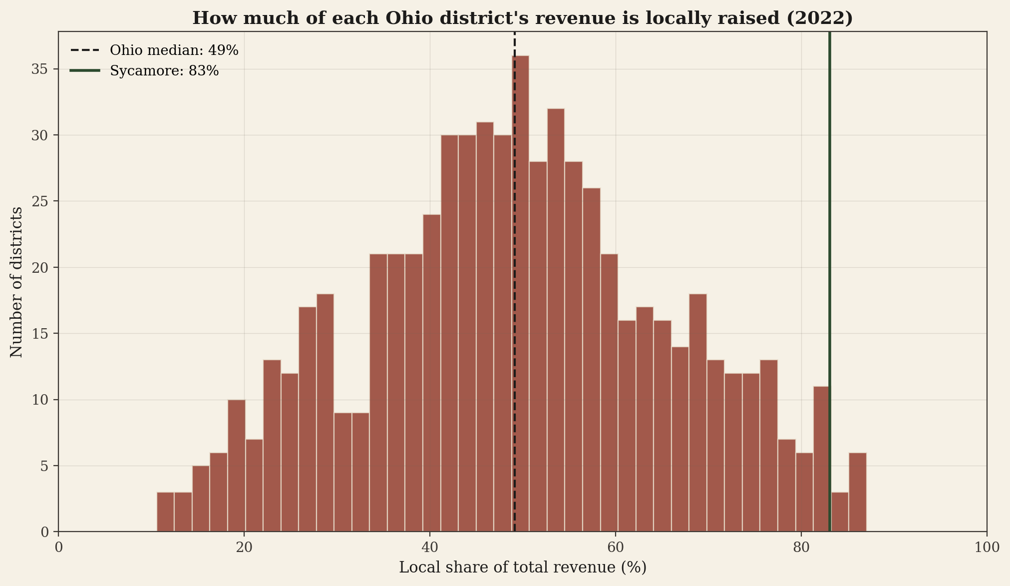
Chart 03 · Histogram
Each Ohio district is a row in the underlying data. The height of each bar is the count of districts whose local-share-of-revenue falls in that bucket. The Ohio median is marked with a dashed line; Sycamore Community Schools is marked separately. Most districts cluster near the 50% mark, with a long right tail of high-local-share districts that goes well past 80%.
Two Ohios, in one number
The bulk of districts cluster around 35-55% local share. These are the at-or-near-floor districts where HB 920 lets inflation flow through. The right tail — districts above 65% — is the above-floor population. They captured the high property valuations of the 1990s and 2000s into their voted operating millage, and have been frozen in nominal terms ever since. Sycamore at 83% sits in this tail.
For at-floor districts, a 22% Hamilton County valuation jump (as occurred in 2023) flows directly into operating revenue. For above-floor districts like Sycamore, that same valuation jump produces almost no new operating revenue because the reduction factor rolls back the voted millage. The state's foundation formula then treats the higher valuation as higher local capacity — depressing Sycamore's already-low state share further. This is the structural arithmetic the FSFP was designed to address; the HB 96 freeze closed that window.
Per-pupil spending across Ohio districts varies less than between U.S. states.
The 50-state ranking on the national page shows a 3.1× ratio between top and bottom states. Inside Ohio, the ratio is much smaller — about 1.6× between the 90th and 10th percentile of districts. That is partly a function of Ohio's foundation formula attempting to equalize, partly a function of Ohio being a relatively economically homogeneous state, and partly a function of the data definition (this is current-operating only — capital spending is excluded, which is where some of the most extreme variation lives).
Chart 04 · Histogram
Each Ohio district is one observation. Distribution shows the mass clustering around the median ($15,858 per pupil) with shorter tails than the state-by-state distribution. Sycamore marked individually for reference.
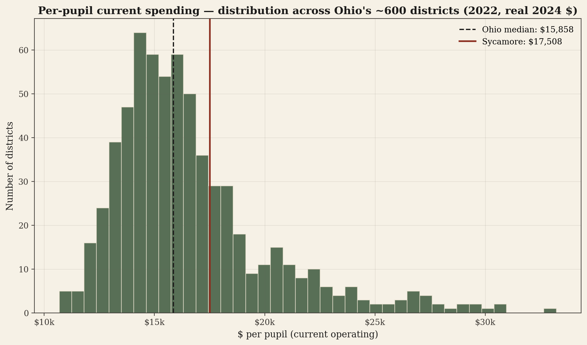
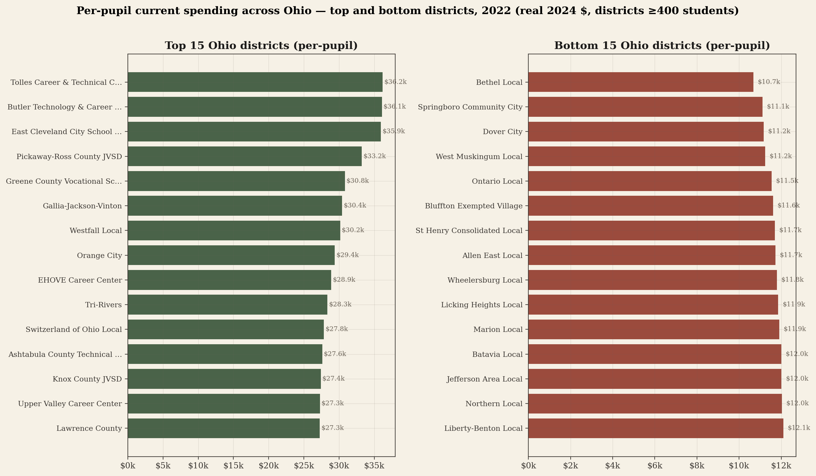
Chart 05 · Top and bottom 15 districts
The top 15 and bottom 15 Ohio districts by per-pupil current spending in 2022, restricted to districts with at least 400 students (so single-school online charters and tiny rural districts don't dominate the extremes). Real 2024 dollars.
Sycamore vs its named peer districts, in real dollars.
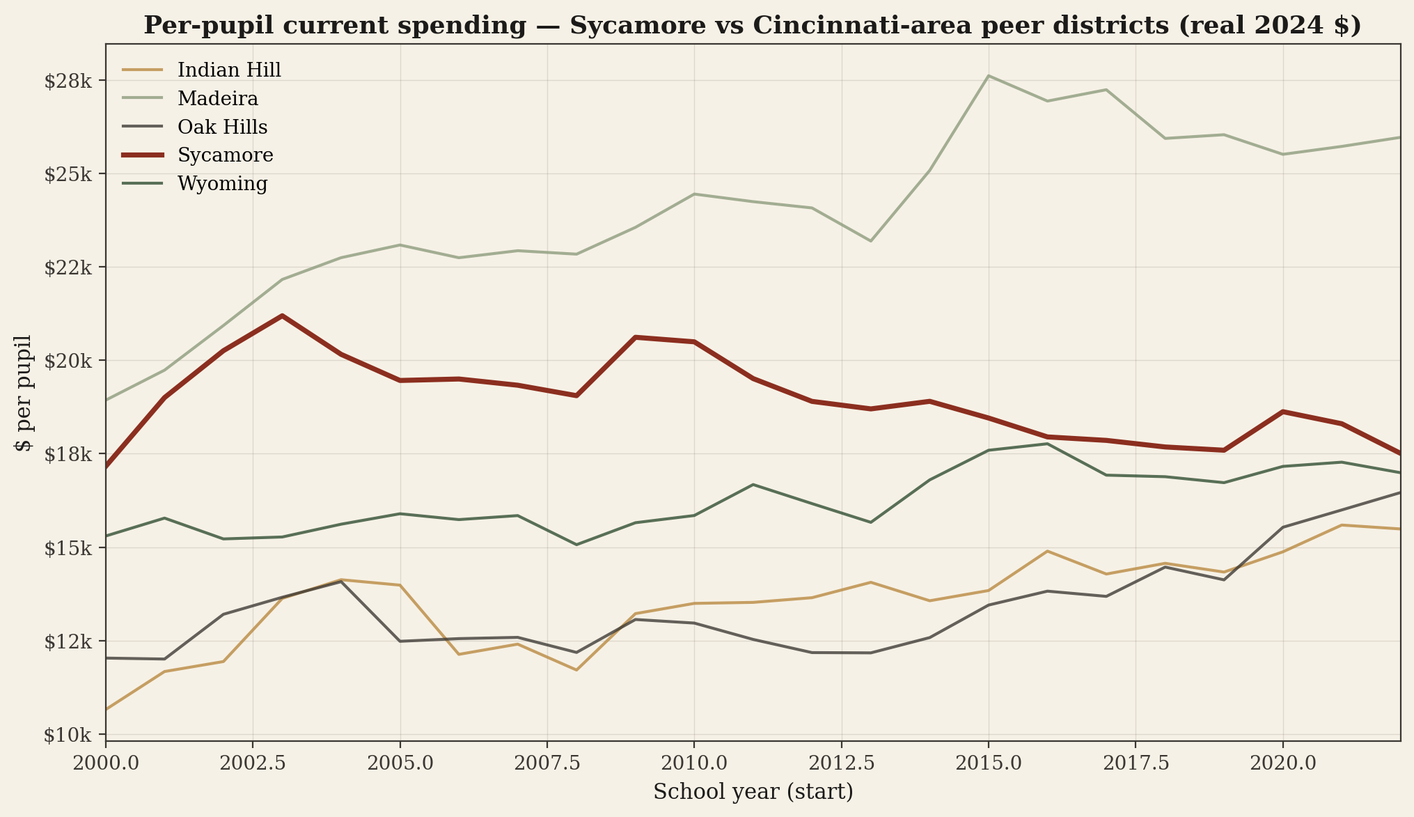
The Cincinnati-area suburban districts that Sycamore has historically competed with on academic rankings — Indian Hill, Wyoming, Mariemont, Madeira, Forest Hills, Mason, Oak Hills — sit on a per-pupil ladder that has shifted over the last two decades. The chart below uses the same definition (current operating spending divided by enrollment, in real 2024 dollars) for each district.
Chart 06 · Peer-district lines
Annual per-pupil current operating spend, real 2024 dollars, for Sycamore and five named peer districts in suburban Cincinnati from 2000 onward. Sycamore drawn in brick (heaviest weight); peers in muted tones for visual focus.
exp_current_elsec_total already strips out most capital, but residual variation remains.
Sycamore's per-pupil operating spend has grown roughly in line with peer districts since 2000 — but the path to that spending has been very different. Sycamore is at 83% local share while the typical peer is at 50–70%. Sycamore funds the same per-pupil number with property tax in a system designed for districts at or near the 20-mill floor — and pays for that with effectively zero new operating revenue in inflationary years.
Ten points of the U.S. state-share average disappeared from Ohio over thirty years. The dollars that disappeared were replaced by local property taxes — at every district, all the way out the right tail. That tail is where Sycamore lives.
→ The half-century receipt → The law-by-law record → U.S. landscape